Découvrez les histoires inspirantes des travailleurs de première ligne : les grands noms de l’industrie manufacturière ! En savoir plus
January 10, 2025
You’ve invested in technology, you’ve trained your workforce, but where do you focus your improvement efforts for maximum impact? The Pareto chart, a powerful visualization tool based on the 80/20 rule, provides the answer. By identifying the « vital few » causes that contribute to the majority of your challenges—whether it’s device malfunctions, network issues, or something else entirely—you can prioritize solutions and unlock significant gains in efficiency.
Manufacturers are inundated with data, but how can they extract meaningful insights to drive real improvement? The Pareto chart provides a data-driven roadmap, pinpointing the critical areas that have the greatest impact on their connected workforce.
A Pareto chart, also known as a Pareto diagram or Pareto graph, is a specialized bar graph that visually represents the relative importance of different factors contributing to a particular outcome. It’s based on the Pareto principle, or the 80/20 rule, which suggests that roughly 80% of effects stem from 20% of causes. In a manufacturing setting, this could mean that 80% of production delays are caused by 20% of machine malfunctions or 80% of quality defects originate from 20% of process errors. By clearly visualizing these imbalances, Pareto charts help identify the « vital few » issues that deserve immediate attention.
The Pareto principle, named after Italian economist Vilfredo Pareto, was first observed in the late 19th century when Pareto noticed that 80% of the land in Italy was owned by 20% of the population. This principle was later adapted to various fields, including quality control and management, leading to the development of the Pareto chart by Dr. Joseph M. Juran in the 1940s. Today, Pareto charts have become an indispensable tool in modern manufacturing, especially with the rise of connected worker solutions. These platforms provide the data and insights needed to create accurate and actionable Pareto charts, enabling faster and more effective problem-solving.
Pareto charts become even more powerful in a connected workforce, where data is readily available from multiple sources- machines, sensors, and worker devices. Connected worker platforms can aggregate and analyze this data, automatically generating Pareto charts that highlight the most critical issues impacting productivity, quality, or safety. This allows managers and frontline workers to quickly identify bottlenecks, prioritize improvement efforts, and make data-driven decisions in real-time.
A Pareto chart is more than just a bar graph; it’s a powerful tool for visualizing and prioritizing improvement opportunities. Let’s break down the key components of a Pareto chart and how connected worker solutions leverage these elements to enhance productivity on the factory floor.
The foundation of a Pareto chart is its bar graph. Each vertical bar represents a specific category or cause of a problem, with the height of the bar corresponding to its frequency or impact. In the context of a connected workforce, these categories might represent machine downtime causes, types of safety incidents, or reasons for production delays. Connected worker solutions can automatically generate these bar charts, pulling data from various sources like machine sensors, worker reports, and production logs. This allows teams to quickly visualize which issues occur most frequently and prioritize their improvement efforts accordingly.
Overlaying the bar chart is a line graph that represents the cumulative percentage of occurrences. This line visually demonstrates the Pareto principle in action. Starting at the leftmost bar (the most frequent cause), the line steadily climbs, showing the total percentage of occurrences accounted for by each successive category. This helps connected workforce teams quickly identify the « vital few » causes that contribute to the majority of problems, typically around 80%. By focusing on these key areas, teams can achieve the most significant improvements with their efforts.
The categories and frequencies displayed on a Pareto chart are derived from data collected by connected worker solutions – tracking various metrics related to worker performance, machine health, and production processes. By categorizing and measuring the frequency of different issues, connected worker solutions provide the raw data for constructing meaningful Pareto charts. This empowers users to make data-driven decisions, allocate resources effectively, and track the impact of improvement initiatives over time.
While the concept of a Pareto chart is simple, creating one that accurately reflects your operational reality requires reliable data and the right tools.
To create a truly effective Pareto chart, you need high-quality, real-time data that accurately reflects the situation on your production floor. Traditional methods of data collection, often manual and prone to errors, can lead to misleading insights and misguided decisions. This is where connected worker platforms come into play.
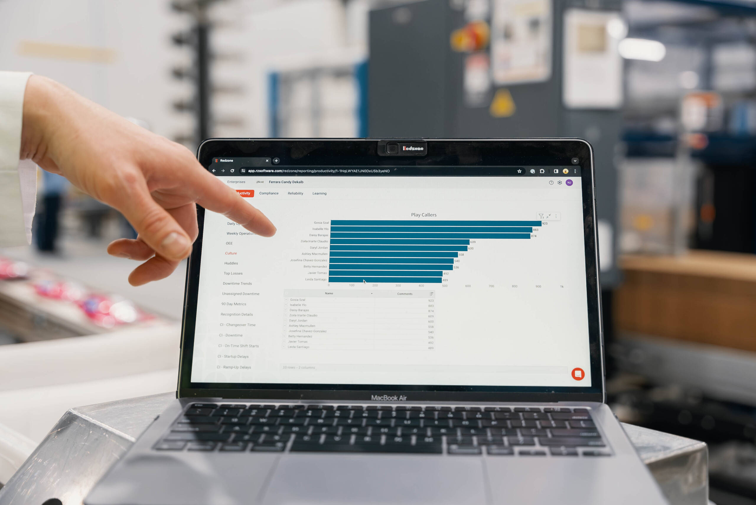
Solutions like Redzone’s Frontline Collaboration empower workers to collect and visualize real-time data directly from the production floor. These platforms automatically aggregate, analyze, and visualize data, making it easy to generate Pareto charts with just a few clicks. This eliminates the need for manual calculations and spreadsheet manipulation, freeing up your team to focus on what matters most: interpreting the insights and taking action.
Creating a Pareto chart with the help of a connected worker platform is a straightforward process:
Creating a Pareto chart is just the first step. The real value lies in interpreting the visual and extracting actionable insights to drive improvement.
Pareto charts provide a clear visual representation of the factors contributing to a specific problem. If you’re analyzing the causes of production downtime, your connected worker platform might track data on machine malfunctions, operator errors, material shortages, and maintenance delays. The Pareto chart will then visually rank these factors based on their frequency, highlighting the most significant contributors to downtime.
Pareto charts serve as an excellent starting point for root cause analysis. By identifying the most frequent or impactful factors, they guide you towards the areas where deeper investigation is needed. Connected worker platforms often integrate root cause analysis tools that can be used in conjunction with Pareto charts to delve deeper into the « why » behind the problems. If « machine malfunction » is identified as a major contributor to downtime, you can use root cause analysis tools within your connected worker platform to explore the reasons behind those malfunctions. Are they due to a lack of preventive maintenance? Operator error? Or perhaps a faulty component?
Platforms like Redzone offer a suite of tools that can be used in conjunction with Pareto charts to gain a more comprehensive understanding of your operations.
For example, Redzone’s Analytics tool provides in-depth insights into production performance, enabling you to track key metrics, identify trends, and pinpoint areas for improvement. By combining these analytics with Pareto charts, you can gain a clearer picture of your operational efficiency and make data-driven decisions to optimize your processes.
Similarly, Redzone’s Compliance tool helps ensure adherence to safety regulations and standard operating procedures. By integrating compliance data with Pareto charts, you can identify potential safety hazards, prioritize corrective actions, and create a safer work environment.
Pareto charts are versatile tools that can be applied to a wide range of manufacturing scenarios to drive improvements in efficiency, quality, and productivity. Here are some practical examples of how Pareto charts can be used in conjunction with connected worker platforms:
Connected worker platforms often collect real-time data on product quality and defects, providing valuable insights into potential problem areas. By analyzing this data with Pareto charts, manufacturers can quickly identify the most frequent types of defects or the production steps that contribute most significantly to quality issues.
For example, a Pareto chart might reveal that 80% of defects are caused by just 20% of possible issues, such as incorrect machine settings, operator errors, or raw material inconsistencies. This allows quality control teams to focus their efforts on addressing those specific issues, implementing corrective actions, and improving overall product quality.
Connected worker platforms can also help identify and ensure error-proof production steps through Pareto chart analysis. By tracking data on errors, deviations, and rework, manufacturers can pinpoint the steps in their production process that are most prone to errors.
This information can then be used to implement error-proofing measures, such as visual aids, checklists, or automated checks, to minimize the risk of errors and improve process consistency. Pareto charts can also be used to track the effectiveness of these error-proofing measures over time, ensuring that they are delivering the desired results.
Downtime is a major concern for manufacturers, and Pareto charts can play a crucial role in identifying its root causes. Connected worker platforms track various downtime events, such as machine breakdowns, changeovers, and material shortages, providing the data needed to create insightful Pareto charts.
For example, a Pareto chart might reveal that a significant portion of downtime is attributed to changeovers between different product runs. This insight could lead to process improvements, such as implementing Single Minute Exchange of Dies (SMED) techniques, to reduce changeover times and increase overall equipment effectiveness (OEE).
When analyzing downtime using Pareto charts, tools that track and reduce changeovers and breakdowns can be invaluable. With Redzone’s Productivity tools, you can monitor and manage production line efficiency, making it easier to identify key downtime factors and improve overall productivity on the shop floor.
This section will provide a balanced view of the benefits and drawbacks of using Pareto charts in a connected worker environment.
Let’s move from theory to practice with a real-world case study demonstrating the tangible impact of Pareto charts within a connected worker environment.
A food processing plant was experiencing significant production losses due to frequent line stoppages. These stoppages stemmed from various sources, including equipment malfunctions, material shortages, quality issues, and operator errors. The plant’s management team, seeking to address these challenges and improve overall efficiency, implemented a connected worker platform to gain greater visibility into their operations.
The connected worker platform, equipped with sensors, mobile devices for workers, and integration with existing production systems, began collecting real-time data on line stoppages. This data included:
This data was then aggregated and analyzed within the platform, automatically generating Pareto charts that visualized the frequency of each stoppage cause. The Pareto chart clearly revealed that a significant majority of stoppages (over 70%) were caused by two primary factors:
Armed with this insight, the plant’s maintenance and quality control teams took targeted action. They:
The impact was significant. Within weeks, the plant saw a dramatic reduction in line stoppages, leading to:
Pareto charts are invaluable tools for identifying and addressing the « vital few » challenges that can disrupt optimal workflows. By combining the analytical power of Pareto charts with the real-time data and insights provided by connected worker solutions like Redzone, manufacturers can:
With real-time data collection, automated analysis, and a suite of integrated tools, Redzone empowers manufacturers to optimize their operations, enhance productivity, and achieve sustainable growth.
Ready to transform your manufacturing processes?
Book a Demo with Redzone to see how connected workforce solutions can elevate your operations and drive remarkable results.
Données de productivité issues de 1 000 usines : le plus vaste en...
Contactez-nous et commençons à responsabiliser votre personnel de première ligne et à augmenter vos bénéfices.